Home » Casino news » What is Online Casino Lobby and How to Find the Game You Want?
What is Online Casino Lobby and How to Find the Game You Want?
Over the years, players get used to the platform they play on. This makes it easy to overlook some flaws that might cause issues for someone else. These user interface woes affect more than just online casinos and games. They can be found across the internet, though in thankfully lower numbers than before. Solving this problem is very important, as it drives up user engagement.
Because of that, many operators and software providers spend lots of time and effort into perfecting their user interface. Keeping things clear and visible is more than just aesthetics. It makes punters more likely to engage with your software! To showcase the importance of this, we will take an in-depth look into online casino lobbies.
What are Online Casino Lobbies?
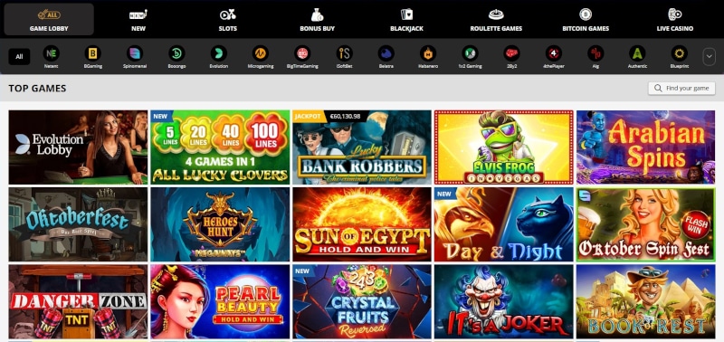
The lobby is usually either the first or second page you will land on. Some operators will have a separate landing page when you first launch and only allow you access to the lobby after registering. The lobby does several things. It gives you an overview of all the games the casino offers. It makes it clear what promotions are available. Finally, it should allow you to easily get help if something goes wrong.
Keeping these values in mind is important when designing a lobby. As time goes on, online casinos found a good way to get both aesthetically pleasing and functional lobbies. Really, the only downside to this is that it makes all websites look similar to one another. Then again, that was inevitably going to happen, given the rise of mobile gambling.
Best Lobby Designs
You, as a player, want your journey from registering to playing to be as seamless as possible. A good casino lobby is one you rarely see because it makes finding games easy. This is why the most popular releases are always featured front and centre. Search bars are also made very clear and are designed to be easy to use.
Added functionality is important, but it should not get in the way of a clean user interface. Search filters are a useful tool, but you usually need to reveal them by clicking a button. Player attention should be firmly fixated on available promotions and the games they can play. Anything extra should be at the sidelines.

Learn how to navigate your way through an online casino lobby.
Registration should also be as painless as possible. Every small optimisation in how players enter their data should be considered. We have gotten to the point where operators are able to process your information in less than a minute.
Finally, an excellent user interface will make sure you can quickly access the information you need. Ideally, access to live chat or an FAQ page should not be more than two screen taps away. Information like game RTP and volatility should be clearly marked to let players find what they are looking for. If a filter system exists, it should allow you to sort to find the exact game type you are interested in.
Things to Avoid
Part of keeping things clear is to leave enough room on the screen so players can make out the important bits. Without sufficient space, everything kind of blends together in a confusing mess. This trend has disappeared as UX designers got better and screen space got smaller thanks to phone screens. If you want a good example of how its done, look no further than indiancasinoclub.in!
It goes without saying that you should be mindful that everything fits an overarching theme. Colours should complement one another, and no element should stand out as being out of place.
